Logo Contest (Now open for voting)
Home › Foren › General Discussion › Logo Contest (Now open for voting)
Schlagwörter: logo
- Dieses Thema hat 44 Antworten sowie 21 Teilnehmer und wurde zuletzt vor vor 9 Jahren, 2 Monaten von
– dumbtube – aktualisiert.
-
AutorBeiträge
-
September 20, 2015 um 9:31 am Uhr #998
Timtech
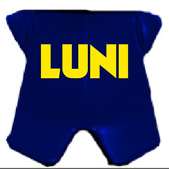
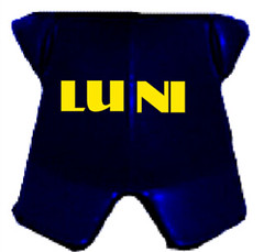
AdministratorWe’re having a LUNI logo contest 🙂 Which one is your favorite? Vote in the poll widget on the side of the page (April 2016 only). NOTE: The logos are numbered differently now that I removed the disqualified logos, so reading posts before April 2016 will be referring to a list that was numbered differently.
#1 – Johntor

#2 – Johntor

#3 – Johntor

#4 – CrownedComedian

#5 – Fustran

#6 – MCM
„It is in two parts and for a very good reason. The smaller part is meant to be a ‚U‘ logo which is also incorporated into the ‚LUNI‘ design.“ ~mcm


#7 – EdenRandomness

#8 – Xiphoseer
„lazily edited, not a production image“

#9 – Pirateronin
„Obviously, the final version would have the logo actually rendered, these are just some mock-ups I made with the tools I had available“


#10 – sambot863

-
Dieses Thema wurde geändert vor 9 Jahren, 2 Monaten von
Timtech. Grund: added logo #10
September 20, 2015 um 9:48 am Uhr #999Knightoffaith
Moderator1, 5, 6, and 7 are disqualified. LEGO is VERY specific in their Fair Play policy that their logo should not Be used.
Love 3 and 4… Could there be a version of 4 with the U in italics, and maybe one with everything in italics, as well?
September 20, 2015 um 1:14 pm Uhr #1008Vernerl
TeilnehmerI’ll vote for number 3, for now.
September 20, 2015 um 1:32 pm Uhr #1009Knightoffaith
ModeratorBtw the issue with #5 is that is was essentially the Logo, just different letters. The core of it was still the same.
September 20, 2015 um 4:17 pm Uhr #1018Xiphoseer
Moderator
I’d propose something like this (lazily edited, not a production image)
September 20, 2015 um 4:25 pm Uhr #1019mater06
ModeratorThe logo needs to be a cheeseburger. Yeah, that’s what we need.
September 20, 2015 um 4:27 pm Uhr #1020Knightoffaith
ModeratorBingo Xiphoseer
September 20, 2015 um 4:53 pm Uhr #1022Vernerl
TeilnehmerWe could put a LEGO burger from the new Skooby Doo line above the „I“?
Oktober 2, 2015 um 8:23 am Uhr #1159CrownedComedian
TeilnehmerURL link form
It’s not Christmas yet, right?

…the background is alpha
…why is it black?-
Diese Antwort wurde vor 9 Jahren, 8 Monaten von
CrownedComedian geändert.
Oktober 2, 2015 um 11:16 am Uhr #1167mater06
ModeratorNow that looks cool…
Oktober 2, 2015 um 11:37 am Uhr #1168CDFalcon
Teilnehmer^ love that one…
Oktober 2, 2015 um 5:22 pm Uhr #1172Knightoffaith
ModeratorI think that would be great for a banner, not sure about a logo though.
*Nudge* Tim, how about using this for the site banner? 😉
Oktober 2, 2015 um 7:00 pm Uhr #1179Timtech
AdministratorThis site’s banner? It will definitely conflict with our current setup really bad. But I added it to the list 🙂
Oktober 2, 2015 um 7:34 pm Uhr #1183Pirateronin
TeilnehmerI borrowed a friend’s computer to try and render a sketch image. Unfortunately, Blender’s rotation feature has mysteriously locked itself, and I didn’t have time to get the „Emit“ function to emit at the proper color levels, so the sketch image was a wash. Here’s a brief description of how it should have turned out – does it sound promising, or it is overcomplicated?
A basic minifig, glowing (hopefully transparent) blue like the Mythrans did, wearing a red construction helmet with a orange rim, holding a pirate cutlass with a glowing blue edge in his right hand, and a silver katana in his left. On his chest, there’s a standard LEGO armor piece, colored dark blue, with LUNI in capital yellow letters in the center, like a crest.
I was trying to include something easily recognizable from all four factions. (Hard hat=Assembly, Cutlass=Venture League, Katana=Paradox, Knight’s Armor=Sentinel.)
-
Diese Antwort wurde vor 9 Jahren, 8 Monaten von
Pirateronin geändert.
Oktober 2, 2015 um 7:50 pm Uhr #1185Pirateronin
Teilnehmer….Aaaand in reflection, I realize that yes, it is definitely overcomplicated. -_-
Back to the drawing board…
-
Dieses Thema wurde geändert vor 9 Jahren, 2 Monaten von
-
AutorBeiträge
- Du musst angemeldet sein, um auf dieses Thema antworten zu können.
Comments are currently closed.